A single, flimsy doormat often looks like an afterthought, but layered doormat combos offer an easy way to add professional scale to your entry. This guide rounds up 10 door ideas worth saving to help you find the perfect pairing for your porch.
Coir Base With Striped Top
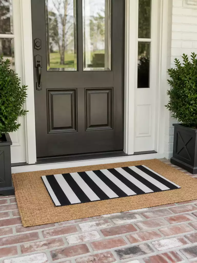
Ground your entryway with a high-contrast foundation that creates a clean, intentional welcome.
As an Amazon Associate I earn from qualifying purchases. Affiliate links may earn me a commission at no extra cost to you.
A single, small doormat often looks lost against the scale of a front door, creating a floating effect that feels like an afterthought. This combination solves the problem through tailored contrast, using the coarse, organic texture of natural coir against the crisp, modern lines of a fabric-style stripe.
To pull this off effectively, your base mat needs to be substantial—aim for a 3×5 ft coir mat to ground the 18×30 in top layer. This provides the necessary 3-inch rule of exposed border, framing the top mat rather than letting it disappear into the porch floor.
Pro-Tip: Material Matters
Select a polypropylene outdoor-rated mat for your top layer to keep those stripes sharp through rain and sun. Avoid cotton or indoor-only fabric mats, which quickly absorb water and stay soggy, leading to mildew and faded patterns.
Avoid the common temptation to pair a striped base with a striped top, as this creates visual chaos that hurts the eyes. By keeping the base in a natural, neutral coir, you ensure the graphic stripe remains the clear focal point of your entryway.
.
💡 Practical Styling Tips for Your Entry:
- Check door clearance: Measure the distance between your door bottom and the threshold to ensure the layered combo doesn’t snag.
- Secure the base: Use rug tape or a non-slip pad under your coir base to prevent the entire setup from sliding.
- Coordinate accents: Choose a striped top mat color that echoes your home’s existing exterior trim or mailbox for a cohesive feel.
Jute Round Under Rectangle
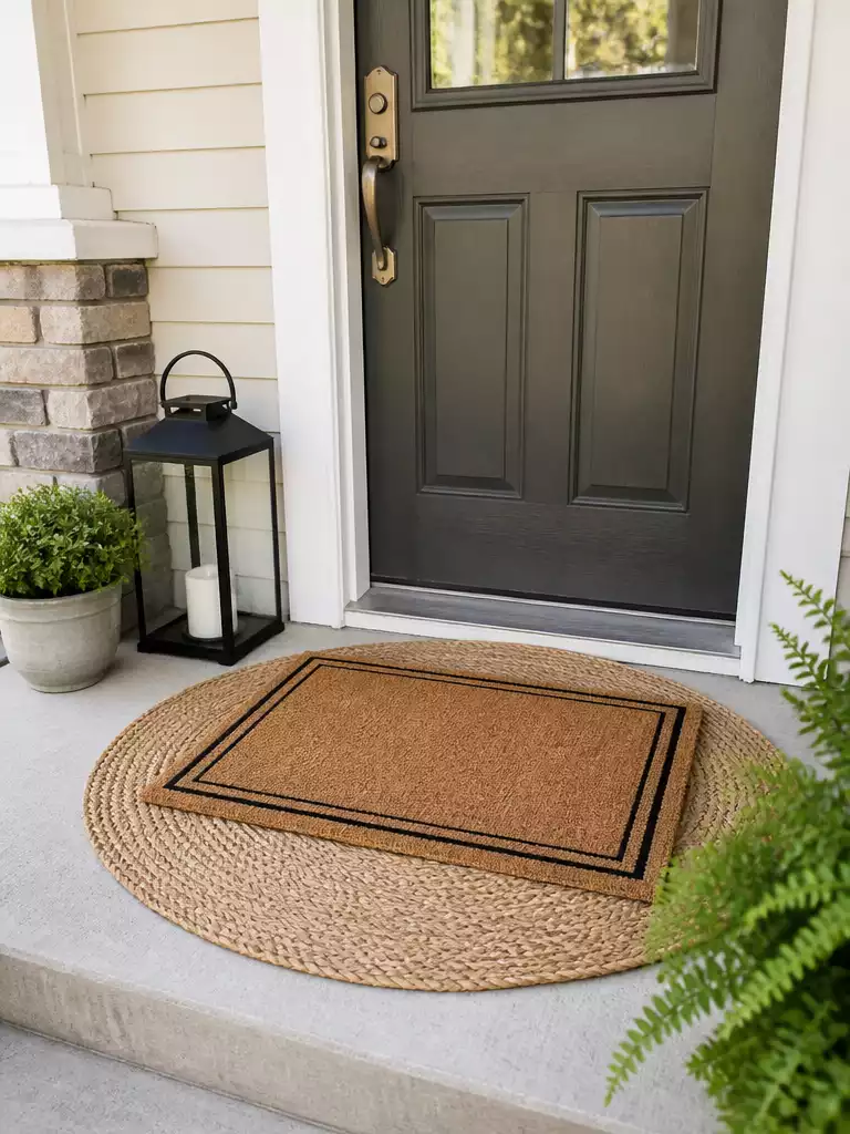
Break up rigid architectural lines with a soft, circular foundation that frames your door.
Do you feel like your front entry looks a bit too boxy? A round jute base is the most effective way to counteract the harsh, straight lines of a doorway and a standard rectangular mat.
The circular geometry immediately draws the eye toward the center of the frame. This creates a more inviting, organic focal point that feels less like a sterile building and more like a home.
Critical Moisture Warning: Jute is a natural fiber that does not tolerate standing water or heavy rain. Only use this specific layered pairing if you have a deeply covered or enclosed porch where the mats will remain bone-dry.
To pull off this look, the proportions are key. You must choose a round base large enough that the corners of your top rectangular mat do not hang over the edges.
Aim for a base diameter that leaves at least three inches of the jute exposed on all sides of the rectangle. This creates a deliberate, professional look that frames the top mat rather than making it look like a floating island.
- The Geometry: The circle acts as a visual relief against square door panels and rectangular windows.
- The Texture: Jute provides a warmer, more relaxed aesthetic compared to the coarse, stiff bristles of traditional coir.
- The Placement: Always center your rectangular mat perfectly on the circle to maintain the balanced, symmetrical appeal of the layout.
This pairing is perfect for anyone leaning into a coastal or relaxed farmhouse aesthetic. If you live in a high-moisture climate without a generous porch overhang, it is best to skip this combination to avoid rapid fiber decay.
.
💡 Why This Works:
Layering circular and rectangular forms creates an immediate “softening” effect that standard mat pairings often miss. By grounding the sharp, linear edges of your door and top rug with a curvilinear base, you break up the visual intensity of the entryway, making the space feel intentionally curated rather than purely utilitarian.
Design Benefit: The circular base acts as an organic frame that instantly elevates your porch’s overall architectural silhouette.
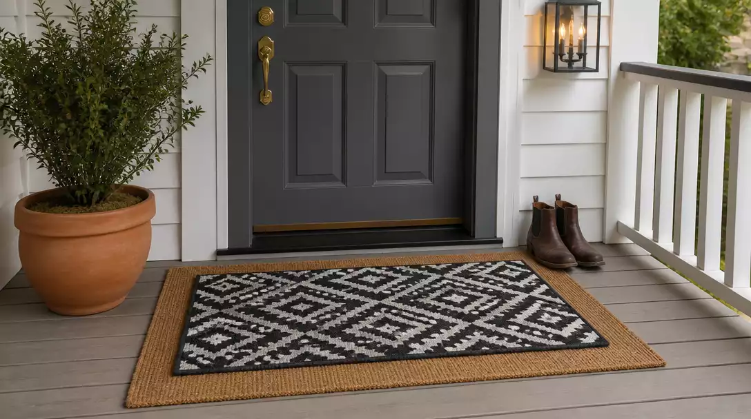
Black and White Check Over Natural
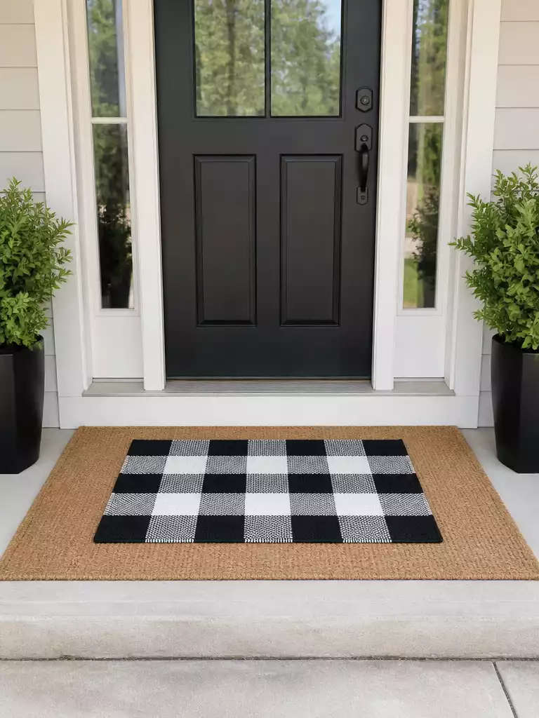
Elevate your entry with high-contrast graphic patterns that ground the space with modern farmhouse charm.
This layering technique is the gold standard for adding high-impact contrast to a front entry. The black and white check pattern forces the eye to focus, while the natural tan tones of the base mat keep the overall look grounded rather than chaotic.
For the best results, aim for a check pattern with 2 to 3-inch squares. If the checks are too tiny, the pattern will appear to vibrate or blur from the street, which creates visual noise instead of a intentional design statement.
Avoid the “Vibrating” Pattern Trap
Never layer two different high-contrast patterns together, as they will compete for attention. Use a plain, solid natural coir or jute base to ensure the check pattern remains the undisputed centerpiece of your porch.
Size matters significantly with this combination to prevent the top mat from getting lost. Always use a 3×5 ft base mat to ensure you have enough surface area to frame the 18×30 in checkered piece effectively.
This style is a perfect fit for homes with neutral siding or brick exteriors looking for a quick, punchy update. If you choose this look, ensure your black and white top mat is explicitly rated for outdoor use to prevent the ink from running or fading after the first rainstorm.
.
⚖️ Quick Decision Guide: Choosing Your Check Pattern
- Choose this if: You want a high-impact, graphic focal point that hides porch debris while feeling intentionally styled.
- Skip this if: Your porch is already heavily patterned or colorful; the high-contrast grid can easily overwhelm smaller, busy entryways.
- Pair it with: Matte black planters or porch lanterns to echo the deep, graphic tones of the checkered pattern perfectly.
Monogram Mat on Woven Seagrass
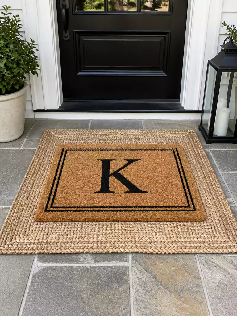
Create a bespoke, curated entry by pairing a sleek woven base with personalized hardware.
This pairing is for the homeowner who wants their porch to feel like a custom-designed space rather than a quick stop at a big-box store. By placing a heavy-duty monogrammed mat over a low-profile seagrass rug, you create a sophisticated foundation that feels intentional and high-end.
The secret here is the texture interplay. The tight, flat weave of the seagrass provides a stable bed for your monogram, while the neutral color allows your specific initial to pop without visual distraction.
Pro Tip: Choose a serif font for your monogram. The classic, sharp lines of a serif font complement the intricate, organic weave of the seagrass base perfectly.
Before you commit, remember that seagrass is a natural fiber that prefers dry environments. This specific combination is best reserved for covered porches where it won’t be subjected to standing water or constant rain.
- Size It Right: Use a standard 3×5 ft seagrass base to provide a balanced frame for your 18×30 in monogram top mat.
- Secure the Layer: Because monogrammed mats can sometimes shift, use a strip of outdoor rug tape under the corners to keep your initial perfectly centered.
- Maintain the Look: Keep this combo in lower-traffic areas to prevent the delicate seagrass fibers from fraying over time.
Caution: Avoid using this pairing in fully exposed, uncovered doorways. Seagrass will trap moisture and can develop mildew if left in the elements.
.
💡 Designer Note: The Art of Font Selection
When layering a monogram, the typeface acts as your porch’s signature. A high-contrast, classic serif font provides a timeless, architectural weight that anchors the organic, textured loops of the seagrass weave. Avoid overly thin or script-heavy monograms, as these can visually “sink” into the natural fiber base, making the lettering difficult to read from the sidewalk.
Front porches often feel disjointed when every architectural line competes for attention, but fixing the geometry of your entryway is simpler than it appears. Focusing on how your front door styles interact with ground-level shapes solves the visual clutter immediately.
Anchoring your entryway requires only one or two intentional shapes to balance the door’s rigid lines, effectively creating a polished, professional look without needing to overhaul the entire porch.
Vintage Rug Over Coir
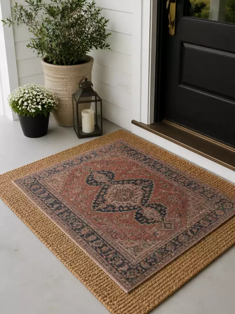
Create a collected, heirloom-inspired entrance by anchoring colorful patterns against a sturdy, neutral foundation.
If you want to move away from the big-box store aesthetic, layering a vintage-style rug over a heavy-duty coir base is your best move. This technique instantly shifts your porch from generic to curated, mimicking the look of a home that has evolved over years rather than a single shopping trip.
The coir base isn’t just for show; it acts as a critical anchor for the usually thinner vintage top layer. Because vintage-style rugs are often thin, the coarse, high-friction texture of the coir prevents the top rug from sliding or bunching when you open the door.
Avoid the “Antique” Trap: Never use a genuine, high-pile antique rug on an exterior porch. They will trap moisture, grow mildew, and become a tripping hazard within days; stick to outdoor-rated, low-pile performance rugs.
When selecting your vintage-inspired piece, look for muted tones that complement your home’s exterior trim or hardware. A deep, faded red or navy pattern can make a neutral or white house feel grounded and lived-in.
Recommended Sizing Guide
- Base Layer: Use a 3×5 ft coir mat to provide enough surface area for a framed look.
- Top Layer: Aim for a rug that leaves at least 3 inches of the coir border visible on all sides.
- Placement: Keep the top rug centered to maintain a balanced, intentional appearance.
This combo is a perfect fit for homeowners who lean toward bohemian or eclectic styles. If your porch is completely exposed to heavy rain, skip this pairing, as both layers will require significant drying time that can lead to rot.
.
📈 The Long-Term Payoff:
Layering vintage-style rugs adds immediate character that makes an entry feel custom-designed rather than store-bought. While these rugs are a near-term decorative cost, using a high-quality coir base protects the top layer from direct floor contact, effectively extending the lifespan of your chosen pattern and keeping the entryway looking polished for longer.
Resale Appeal: A well-curated porch creates a memorable first impression that potential buyers associate with a well-maintained home.
Bold Pattern on Plain Coir
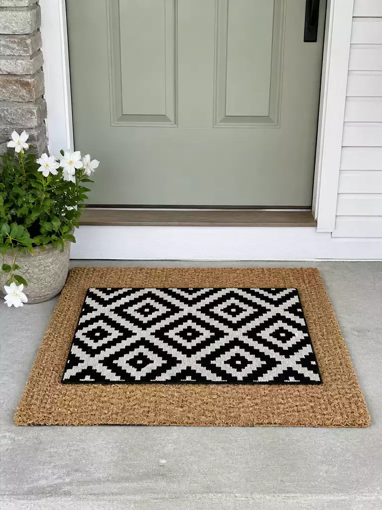
Ground your entry with a neutral base to let high-energy patterns steal the show.
When your porch feels uninspired, you need a high-energy focal point to grab attention. A bold, graphic doormat serves as that singular anchor, but it needs the right canvas to keep the final look from feeling cluttered.
The plain coir base acts as a neutral buffer, allowing artistic or geometric prints to stand out without competing for visual space. Aim for a 3×5 ft base to provide a generous, clean frame for your standard 18×30 in top mat.
Pro-Tip: Coordinate, Don’t Compete
Select a bold pattern that features a secondary color found elsewhere on your home’s exterior, such as your shutter or mailbox color. This creates a cohesive, intentional link between your entryway and the rest of the house.
Keep these points in mind to ensure your bold entry stays crisp and clean:
- Avoid dark mud magnets: Choose patterns with lighter backgrounds, as overly dark mats show every speck of dust and dried mud.
- Size discipline: Always center the patterned mat perfectly on the coir. A skewed mat creates a sense of chaos rather than a curated design.
- Mind the porch moisture: If your entrance is fully exposed to the elements, ensure your coir base is in a covered area to prevent it from becoming a soggy, water-trapping mess.
This pairing is ideal for homeowners who want to inject modern personality into a traditional porch. If your exterior is already heavily patterned with brickwork or intricate siding, you might want to opt for a simpler, neutral layered look instead.
.
🏡 How This Works in a Real Home:
- Entryway transitions: Use this high-energy layer to define your landing zone if your porch lacks architectural definition or clear boundaries.
- Daily maintenance: Keep a stiff brush nearby to quickly clear trapped debris from the coir base without needing to move the entire setup.
- Lived-in styling: Layer your mats slightly off-center if your door swing is restricted, ensuring functionality takes priority over a perfectly symmetrical staged photo.
Two Tone Layered Neutrals
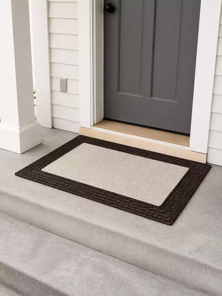
Create a sophisticated, high-end look by focusing on subtle texture shifts instead of loud patterns.
This layering technique is the definition of quiet luxury for your entryway. By ditching high-contrast patterns in favor of tonal variations, you create a refined, monochromatic depth that feels intentionally designed.
It works for any home exterior, from modern minimalist builds to traditional brick facades. Because you are relying on the visual difference between weaves rather than colors, the look stays clean and polished year-round.
Pro Tip: Stick to a 3×5 ft base for the bottom layer. This creates a large enough “frame” to keep the smaller 18×30 in top mat from looking like an afterthought.
Avoid the “monochromatic fade.” If your top and bottom layers are too similar in shade, they will disappear into each other from the street. Ensure there is a distinct difference in value between the two items.
.
💡 Why This Works:
By stripping away high-contrast patterns, you force the eye to appreciate the physical quality of the materials themselves. This monochromatic approach creates a sense of calm and intentionality that makes your entryway feel curated rather than cluttered, allowing the architecture of your door to take center stage.
Design benefit: This technique creates a timeless, high-end look that effortlessly complements any architectural style without ever feeling dated.
Buffalo Check Over Jute
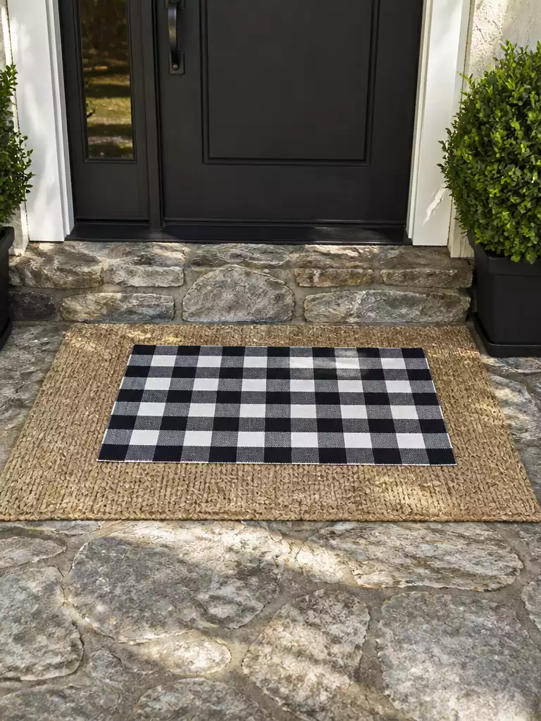
Ground your entryway in rustic charm with this high-contrast, graphic layered pairing.
If your home features stone siding or prominent wood tones, a buffalo check over jute combination adds the perfect punch of rural character. This pairing works because the organic, tan tones of the jute base ground the high-contrast, graphic nature of the buffalo check top mat.
The buffalo check pattern carries a lot of visual weight, so scale is everything here. Aim for squares that are roughly 2 to 3 inches wide to keep the pattern from vibrating or looking chaotic to the eye.
Pro Tip for High Traffic: Jute is a natural plant fiber that can struggle in damp, uncovered entryways. If your porch is fully exposed to the elements, swap the jute base for a polypropylene rug in a similar natural weave to ensure your setup lasts through the season.
Because the buffalo check is such a distinct style, it is best suited for homes that lean toward farmhouse or rustic architecture. Avoid this combination if your home has a sleek, modern aesthetic, as the pattern may conflict with clean, minimalist lines.
Always ensure your base layer is large enough to create a 3-inch border around the buffalo check top. This keeps the entrance looking intentional and professional rather than like a mat that was simply tossed down.
.
⚖️ Quick Decision Guide: Buffalo Check Over Jute
- Choose this if: You want a high-impact, rustic focal point that immediately signals a cozy, cabin-inspired home style.
- Skip this if: Your entryway is completely open to heavy rainfall, as natural jute fibers will quickly degrade and mildew.
- Pair it with: Matte black exterior hardware or dark charcoal house trim to anchor the bold, graphic pattern of the check.
Floral Top on Natural Base
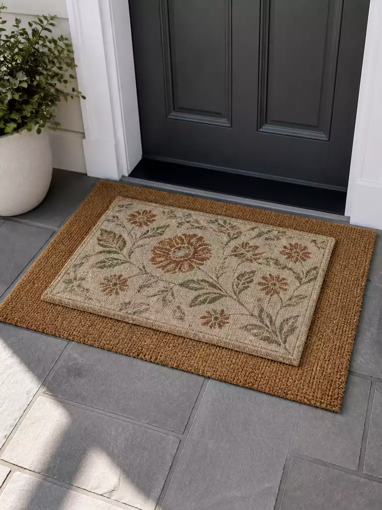
Bring an organic, garden-inspired softness to your entryway by layering delicate motifs over sturdy foundations.
If your porch feels too industrial or rigid, a floral motif is an immediate way to introduce fluid, organic shapes. This layering technique allows you to enjoy a decorative design without the high-maintenance upkeep of a large floral area rug.
The key here is visual balance. Because a floral pattern is naturally busy, the base layer must be a plain, neutral coir mat to act as a buffer.
Pro-Tip: Coordinate Your Palette
Match the colors in your floral mat to the existing greenery or seasonal accents on your porch. If you have terracotta pots or sage-toned shutters, look for a mat that pulls those specific hues into the pattern.
Choosing the right proportions prevents the look from feeling cluttered. We recommend these standard dimensions for a clean, professional finish:
- Base Mat: Use a 2×3 ft or 3×5 ft plain coir mat to provide the necessary structure.
- Top Mat: Stick to the standard 18×30 in size so the floral details remain the focal point.
Who should use this:
This pairing is ideal for homeowners with light-traffic entryways who want a welcoming, cottage-style aesthetic. If your porch is a high-traffic area, place this combo in a protected spot to prevent delicate floral fibers from matting down or fading prematurely.
Avoid the “Clash” Trap
Never pair a floral mat with a patterned base. A patterned base will compete for attention, turning your curated entry into a visual mess.
.
💡 Why This Works:
Floral patterns introduce a fluid, organic silhouette that naturally contrasts with the rigid, straight lines of standard door frames and porch decking. By using a neutral, high-friction coir base, you ground these delicate details, turning a potentially chaotic motif into a sophisticated focal point that feels intentional rather than cluttered.
Visual Anchor: The neutral base allows the intricate floral design to stand out without competing for attention.
Bordered Mat Over Oversized Coir
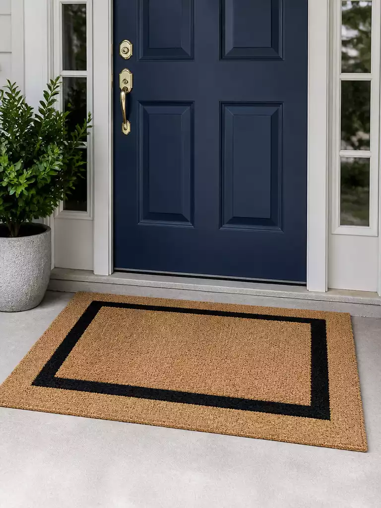
Create a custom-fitted look that makes your entryway feel grand, intentional, and high-end.
This combination is the ultimate fix for a porch that looks unfinished. By using an oversized 3×5 foot coir base, you effectively expand the visual footprint of your entry, making it feel more substantial and grander than a standard small mat allows.
The top layer should be a standard 18×30 inch mat featuring a distinct, clean border. This frame-within-a-frame design draws the eye directly toward the door, replacing the “thrown down” look with one that feels professionally curated.
Pro Tip: Stick to a simple, solid-colored bordered mat for the top layer. Adding extra patterns on top of a large base creates visual noise that competes with your door’s architecture.
This pairing works best for homeowners who want to emphasize a sense of scale. It is particularly effective for entryways with double doors or wide door frames where a single small mat would look lost.
If your porch is open to the elements, prioritize a heavy-duty, outdoor-rated top mat. This prevents the edges from lifting over time and keeps your layered look crisp throughout the changing seasons.
.
🧰 Questions for Your Installer:
- Clearance check: Can we verify the door swing height to ensure the base mat doesn’t snag or drag?
- Surface grip: What professional-grade rug tape or non-slip backing do you recommend for our specific porch material?
- Edge performance: How do we secure the border mat edges to prevent tripping hazards in high-traffic entry areas?
With all ten layered combinations now in front of you, the path to a finished porch is significantly shorter. Choosing the one or two pairings that naturally complement your home’s architecture is far more effective than attempting to adopt every style trend.
A selected door mat arrangement provides the structure, and the rest is simply refinement. Decide on the texture and scale that coordinates with your entry, and the polished result will follow.